Cataldo Capital's brand and websites, designed and built by myself. Includes a logo and identity, an investor site, and a booking site for their Vermont vacation rentals.
Client
Role
Timeline
TEAM
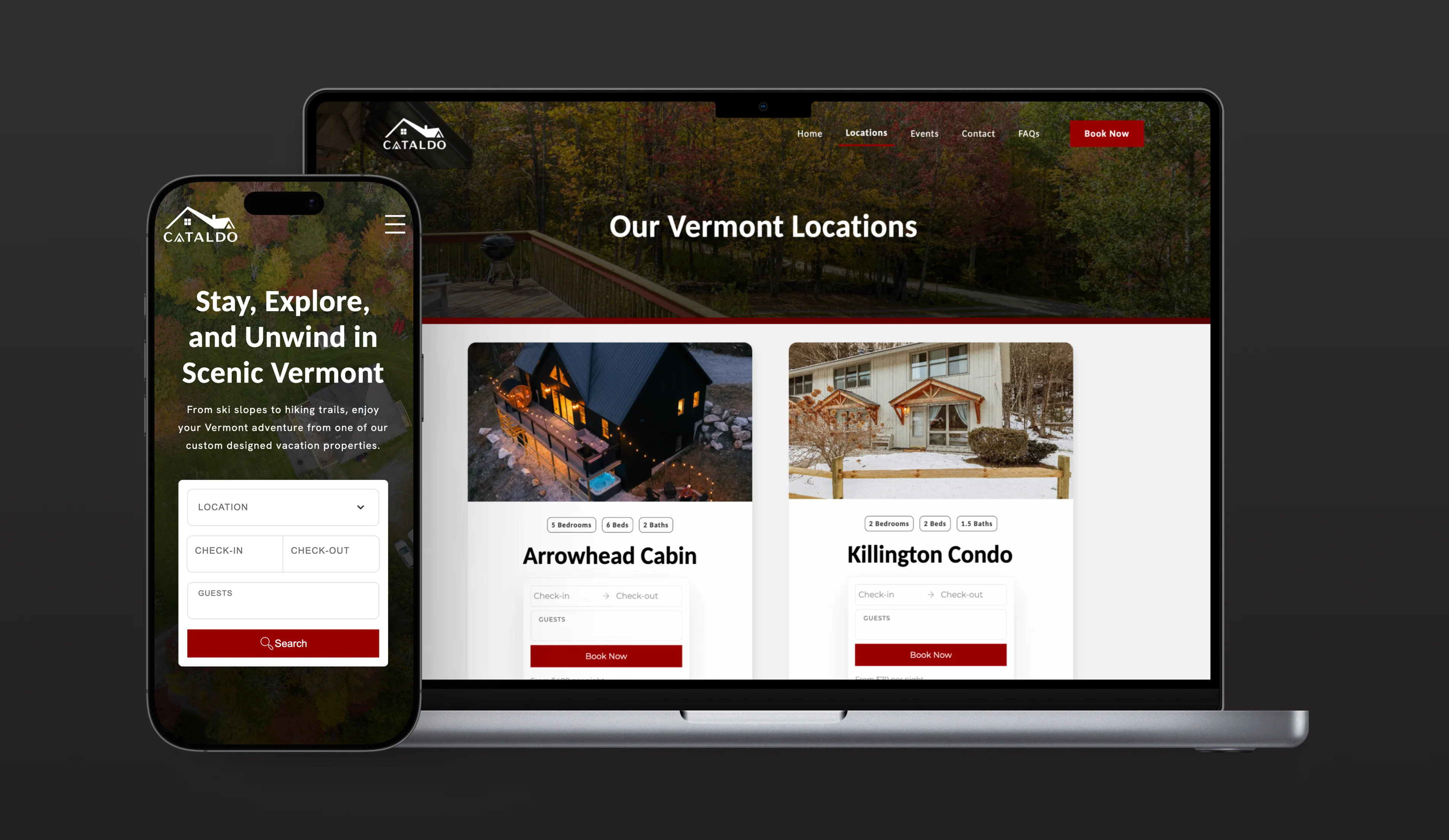

The booking site starts with search. Each cabin card lists bedrooms, beds, and baths, and you pick dates and book right on the card.
Cataldo Capital buys, renovates, and manages vacation rentals near Killington and Mount Snow in Vermont, plus long-term rentals in New York. The same houses have to work for two audiences: guests booking a ski weekend, and investors deciding where to put their money.
One roof, two doors.
Guests and investors want opposite things from the same cabin, so the homepage does one job: it asks which one you are. Booking takes guests to a search by location, dates, and guest count. Investors takes you to the numbers: occupancy, assets under management, and every property in the portfolio. Both sides share one brand, with red as the accent for guests and blue for investors.
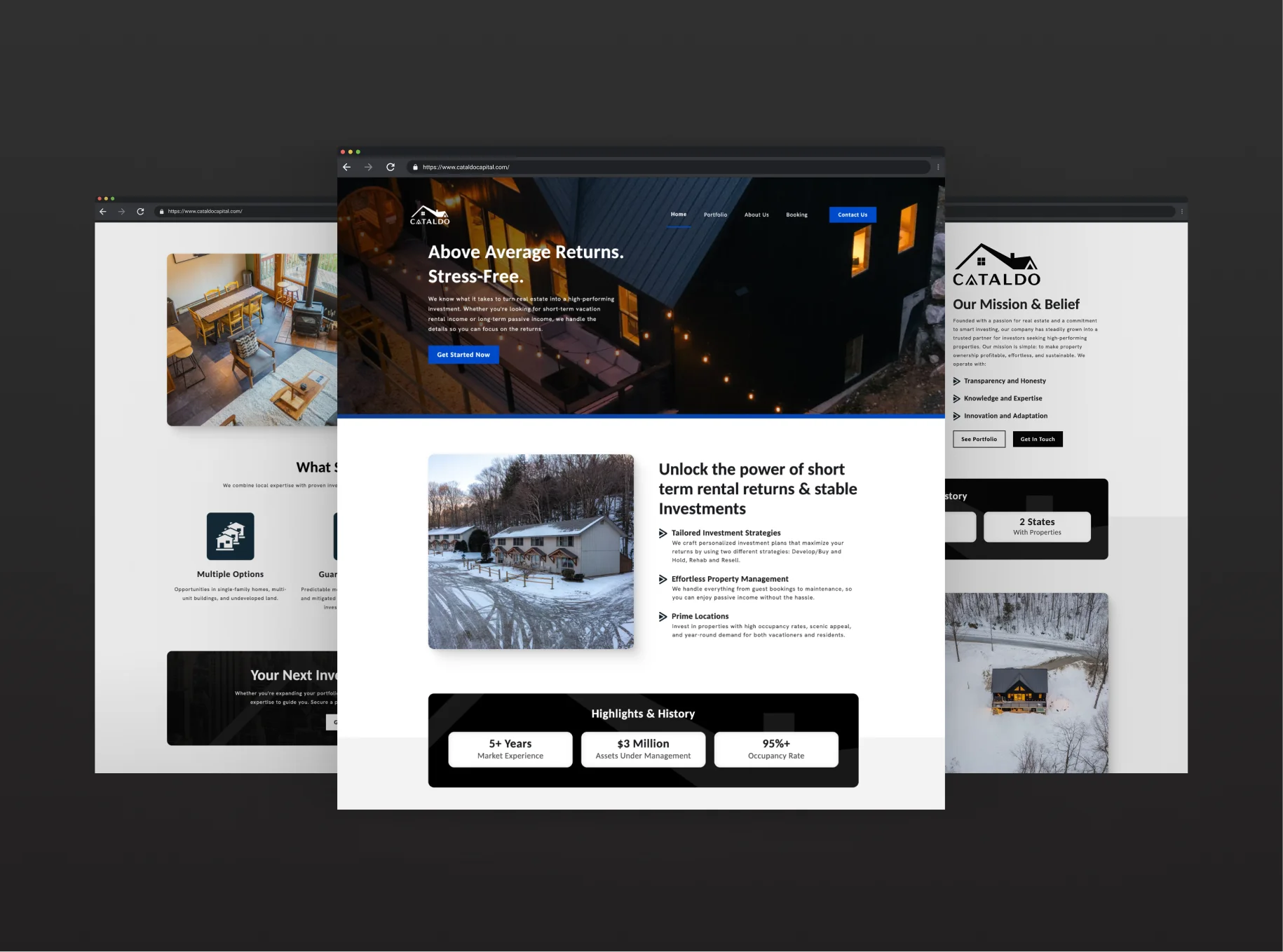
The investor site leads with returns. The portfolio, the strategy, and the company's track record back them up.
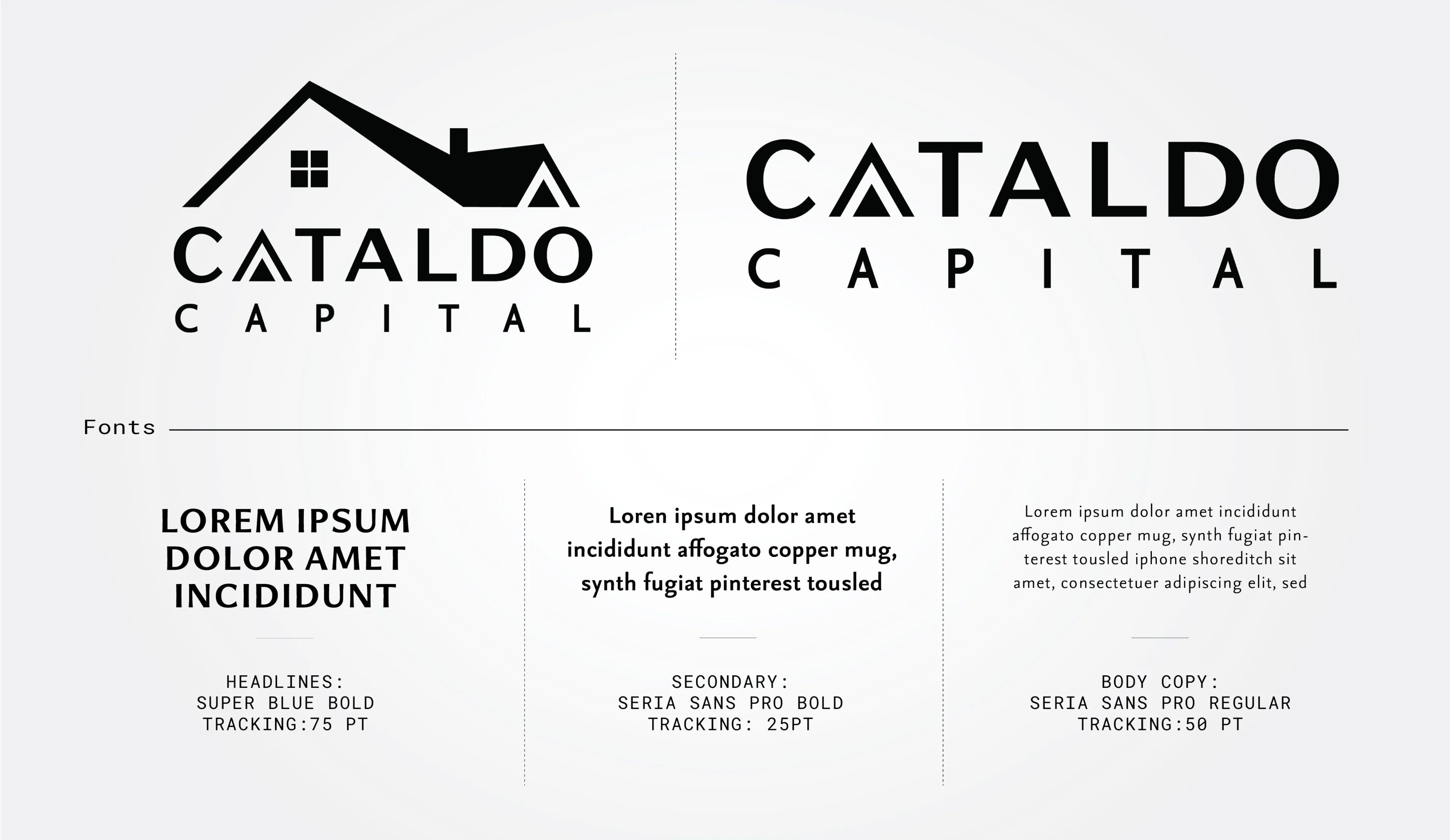
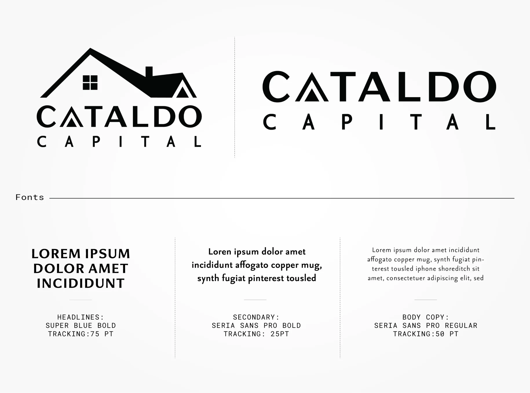
Two lockups, with and without the roof. Super Blue Bold sets the headlines and Seria Sans Pro handles everything else.
The mark is a roofline, and the first A in CATALDO repeats its gable.
A getaway to one, an asset to the other.
A guest looks at a cabin and asks if eight people will fit. An investor looks at the same cabin and asks what it earned last winter. Splitting the site at the front door meant neither had to read past the other's answer, and each page could speak to one person.
Doing the brand first made the build faster. With the logo, type, and palette settled, most of the design decisions for the sites were made before I started developing it.
